
Yan Cui
I help clients go faster for less using serverless technologies.
I recently rebuilt the landing page for both AppSync Masterclass and Production-Ready Serverless. The sites were hosted on Shifter (think serverless WordPress) and Wix respectively. In both cases, the performance of the sites (especially on mobile) left a lot to be desired.
A large portion of the user traffics to these sites comes from mobile. Especially when I promote them on social media! Thanks to the fact that most of my target audience consumes social media content primarily on their phones. So I decided to rebuild the sites from scratch using Vue.js and Tailwind CSS and put mobile performance as a top priority.
As you can see from below, the rebuild was a significant improvement and well worth the effort!
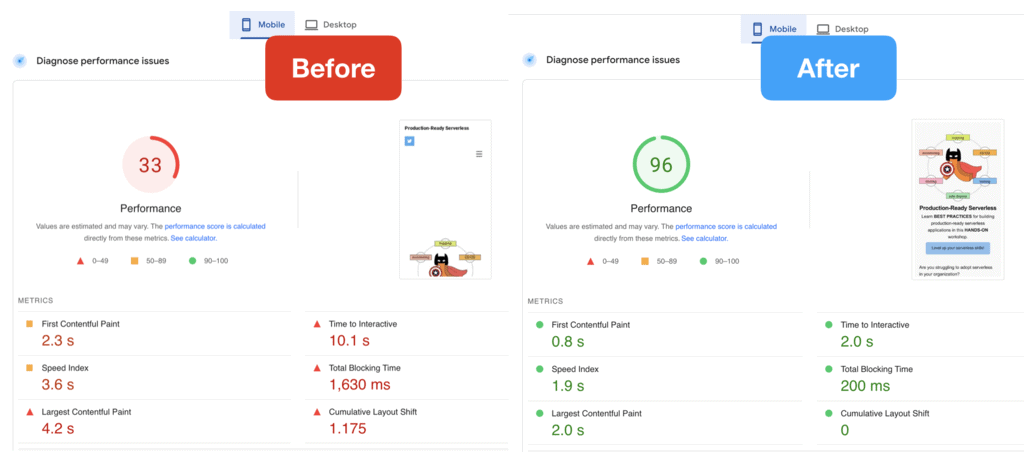
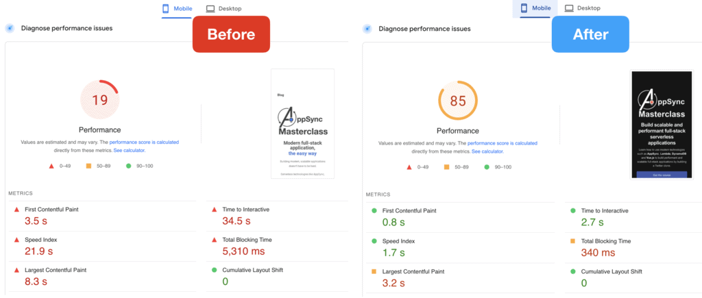
And here are 10 performance optimization tips I learned along the way.
1. Preload large images above the fold
If you have a logo image above the fold, then tell the browser to prioritize downloading it by adding it as a preload in the <head> section of the index.html.
<link rel="preload" as="image" href="... />

2. Use Cloudinary for all your images.
With Cloudinary, you can dynamically resize and optimize (compressed into the webp format) images by adding a few flags to the image URL, like this:
https://res.cloudinary.com/…/upload/f_auto,c_scale,w_180/…/mugshot.png
This resizes the image (mugshot.png) to a width of 180px while maintaining its original proportions. And the f_auto flag generates a webp image, which offers better performance (smaller file, higher quality) than png but it retains the original image extension. Presumably, the original image extension is retained to maintain backward compatibility for browsers that don’t support the webp extension.
Also, the resized images are cached on Cloudinary’s global cloud delivery network.
You can read about Cloudinary’s automatic image optimization feature here.
3. Use “srcset” to serve different images based on the viewport width.
When you’re building a site that has to work on different form factors, you’re almost always going to be serving an image that’s the wrong size for some form factors. If you serve an image that looks great on a desktop then it’s probably too big for mobile. If you serve an image that’s right for mobile then it’s probably too small for a desktop and the image can look poor qualify when scaled up by the browser.
That’s why you should use srcset to specify different images based on the viewport width. This also works well with Tailwind CSS’s sm/md/lg/… prefixes because these have well-defined breaking points based on the viewport width.
This article explains how you can use the srcset and size attributes to serve responsive images for your site. All that’s left is to generate different versions of your images with different sizes. Again, this is where Cloudinary comes in because you can dynamically resize images as discussed above.
Having fixed image dimensions reduces the amount of content layout shift when the page is loading.
This is super useful for square images that you often see with profile pictures or on testimonials.
This is why you’ll often see code like this:
<img class="h-14 md:h-20 w-14 md:w-20 rounded-full ..." />
And as we scale the image for larger devices, we should also serve images that are the right size. That’s where srcset comes in, as described above.
5. Lazy load images that are below the fold.
Images that are below the fold should be lazy-loaded so they don’t impede the browser from downloading and rendering the all-important contents above the fold. So for any image that are below the fold, you should add loading="lazy" to the <img> tag.
<img loading="lazy" ... />
This simple change made a huge difference for me.
This includes scripts such as the Google Analytics script tags.
In fact, you should consider ditching Google Analytics and try out Fathom instead.
I found Fathom’s script to be very lightweight compared to Google Analytics and doesn’t get blocked as often as Google Analytics. Lots of people, especially developers, run ad blockers. So you lose a lot of your traffic through Google Analytics.
But the bigger problem is that Google Analytics is quite invasive and has come under heavy fire under recent GDPR rulings. There’s a chance that going forward, it may be considered illegal if your business is bound by GDPR.
Fathom on the hand, respects your visitors’ privacy and is compliant with GDPR. Oh, and it’s built on serverless technologies! In fact, I spoke with their founder, Jack Ellis, on my podcast a while back. If you haven’t heard it yet, you can catch it here.
Anyway, the main downside to Fathom is that it’s not free. The lowest tier is $14/month. But if you sign up using this link then you can get $10 off your first invoice.
7. Mark non-essential scripts as defer to reduce the amount of blocking.
Another thing you can do is to mark those non-essential scripts with the defer attribute. It tells the browser that the script can be downloaded in parallel to parsing the page, and executed after the page has finished parsing.
This reduces the amount of blocking time and allows the page to be rendered faster.
8. Critical CSS
“Critical CSS” is a technique of extracting the CSS for the above-the-fold content and inlining them into the HTML so the above-the-fold content can be rendered faster for the user.
You can use tools like criticalcss.com to extract the critical CSS and then inline them in your index.html.
To understand how critical CSS works, please read this article.
9. Don’t ever embed YouTube videos.
It’s hard to believe how much embedding a YouTube video can hurt your website’s performance…
I wrote about this in more detail in my last post, have a read here.
TL;DR – don’t do it!
10. Measure, measure, measure.
I use both of these tools to measure the site performance as I iterated on them with my changes.
Both give you a view into how your site performs on mobile and desktop and both offer plenty of useful tips too (including many of the tips I shared above).
Wrap up
There are so many website builders out there and they let you create beautiful-looking websites quickly. But it’s frustrating that almost none of them focus on performance! Their sites perform so poorly, especially on mobile where more and more visitors are coming from.
This is why I really like what Adam Elmore is doing with public.dev where performance is a first class citizen.
If you’re a developer and looking to create a portfolio site to market your skills then you should definitely give public.dev a try.
And finally, the optimizations I listed above are not only good for mobile. They do wonders for the desktop as well.
Here are the before & after comparisons of the two sites for desktop.
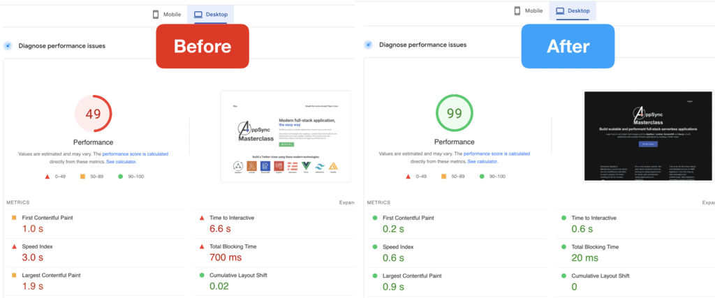
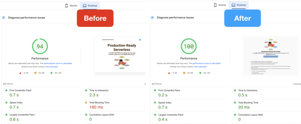
Notice that the Production-Ready Serverless website (previously hosted on Wix) was actually doing OK on the desktop, with a “time to interactive” of 2.3s. And they do some of the aforementioned optimizations already – for example, they automatically convert uploaded images to webp.
But looking at the site’s performance on mobile, with a huge “time to interactive” of 10.1s… clearly WIX just didn’t care about the mobile experience. And because of that, they lost a customer today. But you don’t have to suffer the same fate.
Whenever you’re ready, here are 3 ways I can help you:
- Production-Ready Serverless: Join 20+ AWS Heroes & Community Builders and 1000+ other students in levelling up your serverless game. This is your one-stop shop for quickly levelling up your serverless skills.
- I help clients launch product ideas, improve their development processes and upskill their teams. If you’d like to work together, then let’s get in touch.
- Join my community on Discord, ask questions, and join the discussion on all things AWS and Serverless.
