Yan Cui
I help clients go faster for less using serverless technologies.
As I rebuild the landing page for the AppSync Masterclass I wanted to give this boring “about me” section a facelift.

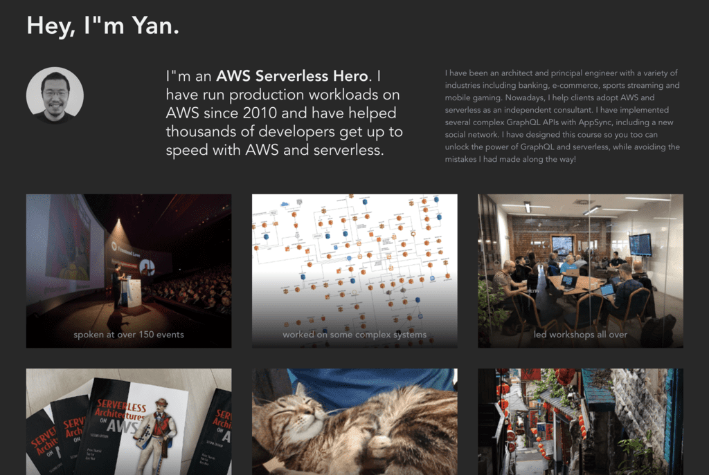
After taking inspiration from other landing pages, I decided to go with something like this.

Notice the gradient effect towards the bottom of each image? It provides a nice backdrop and contrast for the caption and works well against the different background images (some are dark and some are very bright).
To make this work, I used CSS’s ::before syntax to create an empty pseudo ::before element with a gradient background colour.
This is the basic HTML for each image.
<figure class="overlay">
  <figcaption class="z-50">...</figcaption>
  <img class="z-0" src="...">
</figure>
The first thing to note is the z-index values on the <figcaption> and <img> tags. This is to ensure the <figcaption> would appear in front of the gradient fill:
<figcaption> <– z-index: 50
the pseudo ::before element with gradient fill <– z-index: (anything between 1 and 49 would work)
<img> <– z-index: 0
So let’s look at the CSS attributes for this pseudo ::before element.
.overlay::before {
  content: '';
  z-index: 10;
  width: 100%;
  height: 100%;
  display: block;
  position: absolute;
  background: linear-gradient(0deg, rgba(0, 0, 0, 0.9) 0%, rgba(0, 0, 0, 0) 50%);
}
Notice that content is set to ''. Unfortunately, if content is not set, then the pseudo ::before element would not be created. The width, height and position settings ensure that the pseudo ::before element completely overlaps with the <img> tag underneath it (along the z-axis).
You can achieve the same result using additional <div>‘s but I found this to be a very nice technique as it relies entirely on CSS.
Whenever you’re ready, here are 3 ways I can help you:
- Production-Ready Serverless: Join 20+ AWS Heroes & Community Builders and 1000+ other students in levelling up your serverless game. This is your one-stop shop for quickly levelling up your serverless skills.
- I help clients launch product ideas, improve their development processes and upskill their teams. If you’d like to work together, then let’s get in touch.
- Join my community on Discord, ask questions, and join the discussion on all things AWS and Serverless.
