
Yan Cui
I help clients go faster for less using serverless technologies.
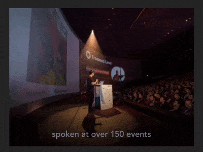
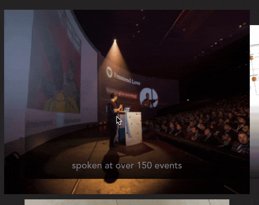
As I rebuild the landing page for the AppSync Masterclass, I wanted to add a zoom-in effect to some of the images, like this:
After some googling and a bit of experimentation, this is what I ended up with.
<figure class="img-hover-zoom">
  <figcaption>...</figcaption>
  <img src="...">
</figure>
When it’s hovered over, the <img> tag would scale up. To make this transition smoother, you can use CSS transition.
.img-hover-zoom img {
  transition: transform 0.2s ease-out;
}

.img-hover-zoom:hover img {
  transform: scale(1.2);
}
But this alone isn’t enough, because the image would overflow from the parent container.
So for the <figure> tag, use overflow: hidden to stop the overflow.
.img-hover-zoom {
  overflow: hidden;
}
And voila, you get a nice zoom-in effect when hovering over an image :-)
Whenever you’re ready, here are 3 ways I can help you:
- Production-Ready Serverless: Join 20+ AWS Heroes & Community Builders and 1000+ other students in levelling up your serverless game. This is your one-stop shop for quickly levelling up your serverless skills.
- I help clients launch product ideas, improve their development processes and upskill their teams. If you’d like to work together, then let’s get in touch.
- Join my community on Discord, ask questions, and join the discussion on all things AWS and Serverless.