
Yan Cui
I help clients go faster for less using serverless technologies.
So NDC Oslo 2014’s finished, it was the first time I’ve attended the conference and I must say it has been a fantastic experience for me. No only was I given the privilege to see so many smart people talking about interesting topics happening in our field, I was also able to meet quite a few prominent members of the F# and Erlang community.
All the videos are available on the NDC Oslo channel on Vimeo, which you can access here.
Here’s my takeaways from the keynote by Luke Wroblewski, It’s a write/read web, which you can find links to the slides and recording at the bottom of the page.
It’s a Write/Read web
What is the write/read web and what do companies like Facebook, Google, Yahoo, Wikipedia, Ebay, Twitter, LinkedIn and YouTube have in common besides being places where people like to spend time on the internet? Well, the experiences they offer only work if people contribute contents to them, hence they all offer what we shall call Write/Read Experiences. In fact, this matches the original vision that Sir Tim Berners-Lee had for the internet:
“The original thing I wanted to do was make [the Web] a place where we could all meet and read & write”
– Tim Berners-Lee
It’s a mobile web
In the US, 78% of monthly US Facebook users are on mobile, in the UK it’s 85%. 30% of Facebook India users are mobile only.
75% of all Twitter users are on mobile.
40% of YouTube views are happening on mobile.
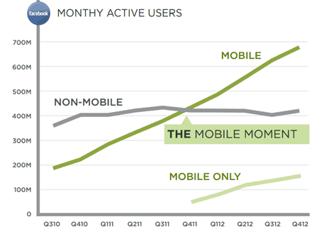
Whilst global sales of PC has dropped to 281M, smartphone and tablet sales has soared to over 2B! This represents an opportunity that quite simply, dwarfs the one we’ve had in the last 2 decades with the PC. Latest numbers according to Gartner:

To illustrate the opportunity that lies before us, Ebay did $13B worth of mobile commerce in 2012, which is up from $4B the previous year.
Mobile is no longer just about games, in fact, games (50% –> 43%) and social networking (30% –> 26%) are down year over year and the big growth area is in the utilities category – find & buy, finances, health, plan, travel, etc.
All these makes the write aspect of the web a big deal because it drives where people spend time on the internet and continues to drive value as it allows people to interact. So the big question for us is, how do we design for mobile creation?
Design for One Handed Use
Based on 1333 observations of people using their devices on the street, their postures fall into three categories:
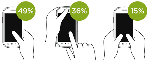
and when you look at the two-handed use cases, it breaks down into the use of the thumb or the index finger:
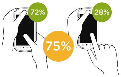
which just illustrates the importance of design for use with one thumb.
Cross-Device usage
86% of US smartphones used while watching TV.
81% use smartphones and TV at the same time.
20% of time on mobile was in front of the TV.
All and all 68% of consumer smartphone use happens at home. And when people use their mobile devices in front of the TV, they still use the same one-handed posture!
Don’t let the keyboard come up (unless there’s no other way)
Typing on mobile devices is painful, so we should try as hard as we can to keep the keyboard away. And here’s some ideas how you might do that:
- choose smart default inputs (e.g. use your current location, etc.)
- use algorithms to give suggestions (e.g. popular flight destinations from a given airport)
- use your locations (e.g. when the default and suggestions fail, use your locations to find nearby airports)
- use a map UI
- use a touch friendly date picker (like the Google one where you touch start and then end date on one scrollable page)
- use sliders
Don’t just put the same mouse interactions onto mobile, target and design for one-handed use!
Focused Flows
Think about what your users are trying to do in your application and really make it easy to accomplish those tasks.
“Creativity is people who care enough to keep thinking about something until they find the simplest way to do it.”
– Tim Cook
Making it easier for users to accomplish their tasks also has fundamental business impacts too. For instance, Boingo found a 34% increase in conversion when they dropped the number of input fields by 11!
Try and get down to the core essence of what the users are trying to achieve.
“Booking a hotel happens in 3 taps and a swipe. This is a competitive advantage.”
– Sam Shank, CEO of Hotel Tonight
Sometimes it can take big changes inside an organization for you to really go small on the design of your input forms because companies struggle to let go of the way they had been doing things in the years. As departments built up in the PC-dominated years trying to exert their involvements in the mobile era, you end up with stuff that isn’t focused enough because it’s built off previous models.
Cross-Device Usages
52% of US laptop owners have smartphone.
31% of US smartphone owners have a tablet.
13% of Americans own laptop, tablet and smartphone and 90% use multiple screens sequentially and most do so in the same day.
Many people also use different devices at the same time.
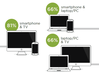
which means there’s a great opportunity for creating experiences that take multiple-devices into account.
Here’s some verbs that map to things that people are trying to do:
- Access
- Flow
- Control
- Push
Access is the ability to view and interact with contents on multiple devices, e.g. Chrome offers the ability to continue browsing on a new device from where you left over on another, and the back/forward buttons continue to work so that you can transition from one device to another seamlessly. Similarly, Amazon’s whisper sync offers the same seamless transitions with your Kindle-enabled devices.
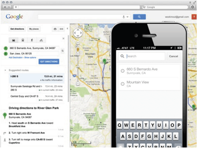
But we want more than just seamlessly move content, we also want to seamlessly move our processes, and that’s Flow. E.g. when you search addresses on Google maps on the PC and later on having access to those searches as dropdowns on the phone. This simple example also illustrates how you can use each device for what it’s good for, the PC is good for seeing the big map and entering addresses, whereas the phone is portable, has GPS and audio directions.
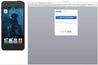
Control allows one device to act as interface for another. E.g. you can turn authentication into a multi-device experience, OneID lets you set one device to unlock only if you send an unlock PIN on another, for instance to log on on the laptop you’ll get a notification on your phone to enter your PIN and unlock the laptop.
Push is the ability to send stuff between devices. You can use screen mirroring to project contents from your mobile devices to your TV, but experiences of using Chromecast doesn’t take advantage of what each device does well. Instead you want to design experiences that are tailored for each device and how they’re used.
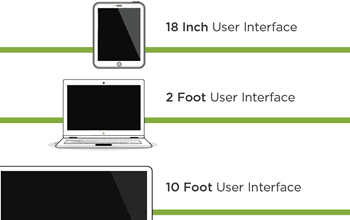
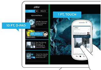
As new types of devices such as iWatch and Google Glass start to hit the market, we will have to push even harder to make the user interface simpler to work on those devices.
Links
Whenever you’re ready, here are 3 ways I can help you:
- Production-Ready Serverless: Join 20+ AWS Heroes & Community Builders and 1000+ other students in levelling up your serverless game. This is your one-stop shop for quickly levelling up your serverless skills.
- I help clients launch product ideas, improve their development processes and upskill their teams. If you’d like to work together, then let’s get in touch.
- Join my community on Discord, ask questions, and join the discussion on all things AWS and Serverless.

Thanks for the notes! Saw you blog from Luke’s tweet.
I attended Luke’s talk on the same topic here in San Francisco. It’s awesome! Also had lots of notes.
At the end of Luke’s talk, he briefly talked about cross-device. I attended another nice talk specifically on “multi-device” recently. It’s by Michal Levin, a Sr. UX at Google. She talked a framework for multi-device environment, and had lots of interesting examples. I took lots of notes, check it out if interested: http://www.yingyingz.com/2014/05/designing-multi-device-experiences-talk-michal-levin/
Her book “Designing Multi-Device Experiences” is also worth reading.
I’m a UX designer in SF.
Yingying
@Yingying – thanks for pointing to that Michal Levin’s work, I’ll have a look and forward it onto our UI/UX designers who I’m sure will be able to learn lots from it.
Do you by any chance have a link to a recording of her talk, the slides would do as well.
Thanks,
I found her talk online: http://www.oreilly.com/pub/e/2740 this looks the same as the talk I attended.
Maybe it’s good to add a wp plugin that supports sending email when there’s reply? I would not know your replied me if I didn’t come to your blog :)
Pingback: Weekly Round-Up: 06/21/2014: Monetization, One-Thumb Design, WWDC - Lattice Labs Blog
Pingback: Personalized UI: Shape Shifting - Umang Jaipuria
Pingback: Being visually honest with F# | theburningmonk.com
Pingback: Year in Review, 2014 | theburningmonk.com