
Yan Cui
I help clients go faster for less using serverless technologies.
Years ago, I used average latency on every dashboard and every alarm. That is, until I woke up to the problems of average latencies along with everybody else in the industry:
- When the dataset is small it can be easily skewed by a small number of outliers.
- When the dataset is large it can hide important details such as 10% of your users are experiencing slow responses!
- It is just a statistical value, on its own it’s almost meaningless. Until we plot the latency distribution we won’t actually understand how our users are experiencing our system.
Nowadays, the leading practice is to use 95th or 99th percentile latencies (often referred to as tail latency) instead. These percentile latencies tell us the worst response time 95% or 99% of users are getting. They generally align with our SLOs or SLAs, and gives us a meaningful target to work towards – e.g. “99% of requests should complete in 1s or less”.
Using percentile latencies is a big improvement on average latencies. But over the years I have experienced a number of pain points with them, and I think we can do better.
The problems with percentile latencies
The biggest problem with using percentile latencies is not actually with percentile latencies themselves, but with the way it’s implemented by almost every single vendor out there.
Percentile latencies are “averaged”
Because it takes a lot of storage and data processing power to ingest all the raw data, most vendors would generate the percentile latency values at the agent level. This means by the time latency data is ingested, they have lost all granularity and comes in as summaries – mean, min, max, and some predefined percentiles. To show you the final 99th percentile latency, the vendor would (by default) average the 99th percentile latencies that has been ingested.
You can’t average percentiles, it doesn’t make any sense! This whole practice gives you a meaningless statistical value, and it’s in no way the true 99th percentile latency of your service. Averaging the percentiles inherit all the same problems with averages that percentile latencies were supposed to address!
I have seen 99th percentile latencies differ by order of magnitude depending on how I choose to aggregate them. Seriously, how am I supposed to trust this number when choosing the max over average can produce a 10x difference! You might as well stick a randomly generate number on the dashboard, it’s almost as meaningful as the “the average of 99th percentiles”.
This practice is so widespread, almost every monitoring tool I have tried does this. Honeycomb is one of the few exceptions because they actually ingest and process all the raw events.
Can’t tell how bad the bad times are
It’s great that we can use percentiles to monitor our compliance with SLOs/SLAs. When things are going well, it gives us that warm and fuzzy feeling that all is well with the world.
But when they go wrong, and sometimes they go very wrong, we are left wondering just how bad things are. Are 10% of my users getting response time of 1s and above? Is it 20%? Could it be 50% of my users are getting a bad experience? I just don’t know! I can use various percentiles as gates but that approach only goes so far before it overwhelms my dashboards.
Most data points are not actionable
As much as I love to stare at those green tiles and line graphs and know that:
- We have done a good job, go team!
- Everything’s fine, there’s no need to do anything
Indeed, most of the information I consume when I look at the dashboard, are not immediately actionable.
To be clear, I’m not saying that percentile latencies are not useful and that you shouldn’t show them on dashboards. But as the on-call engineer, my attention is heavily biased towards “what is wrong” than “what is right”. I want dashboards that match my focus and not force me to scan through tons of information and pay the cognitive price to identify the signals from the noise.
As an application developer, my definition for “what is wrong” is quite different. As an application developer, I’m looking for unexpected changes in application performance. If the latency profile of my service changes after a deployment, or other related event (e.g. a marketing campaign, or a new feature being toggled on) then I need to investigate those.
This dichotomy in what’s important for ops engineers and application developers means we should have separate dashboards for each. More on this later.
What can we do instead?
What could we use instead of percentiles as the primary metric to monitor our application’s performance with and alert us when it starts to deteriorate?
If you go back to your SLOs or SLAs, you probably have something along the lines of “99% of requests should complete in 1s or less”. In other words, less than 1% of requests is allowed to take more than 1s to complete.
So what if we monitor the percentage of requests that are over the threshold instead? To alert us when our SLAs are violated, we can trigger alarms when that percentage is greater than 1% over some predefined time window.
Unlike percentiles, this percentage can be easily aggregated across multiple agents:
- Each agent submits total request count and number of requests over threshold
- Sum the two numbers across all agents
- Divide total number of requests over threshold by total request count and you have an accurate percentage
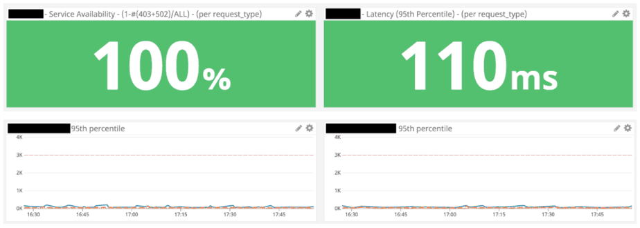
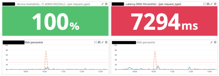
During an outage, when our SLAs are impacted, this metric tells us the number of requests that have been affected. Once we understood the blast radius of the outage, the percentile and max latencies then become useful metrics to gauge how much user experience has been impacted.
Move aside, error count
We can apply the same approach to how we monitor errors. For any given system, you have a small and finite number of success cases. You also have a finite number of known failure cases, which you can actively monitor. But then there are the unknown unknowns – the failure cases that you hadn’t even realised you have and wouldn’t know to monitor!
So instead of putting all your efforts into monitoring every single way your system can possibly fail, you should instead monitor for the absence of a success indicator. For APIs, this can be the percentage of requests that do not have a 2xx or 4xx response. For event processing systems, it might be the percentage of incoming events that do not have a corresponding outgoing event or observable side-effect.
This tells you at a high level that “something is wrong”, but not “what is wrong”. To figure the “what”, you need to build observability into your system so you can ask arbitrary questions about its state and debug problems that you hadn’t thought of ahead of time.
Different dashboard for different disciplines
As we discussed earlier, different disciplines require different views of the system. One of the most important design principles of a dashboard is that it must present information that is actionable. And since the action you will likely take depends on your role in the organization, you really need dashboards that show you information that are actionable for you!
Don’t try to create the dashboard to rule them all by cramping every metric onto it. You will just end up with something nobody actually wants! Instead, consider creating a few specialised dashboards, one for each discipline, for instance:
- Ops/SRE engineers care about outages and incidents first and foremost. Actionable information for them would help them detect incidents quickly and assess their severities easily. For example, percentage of requests that are over the threshold, or the percentage of requests that did not yield a successful response.
- Developers care about application performance. Percentile latencies are very relevant here, as are other resource metrics such as CPU and memory usage metrics.
- Product owners and business analysts might also need their own dashboards too. They care about business metrics such as retention, conversion rate, or sales.
Summary
When you go to see a doctor, the doctor would try to ascertain (as part of the diagnosis):
- What, and where your symptoms are.
- The severity of your symptoms.
- How long have you experienced these symptoms.
- Any correlated events that could have triggered the symptoms.
The doctor would use these information to derive a treatment plan, or not, as might be the case. As the on-call engineer dealing with an incident, I go through the same process to figure out what went wrong and how I should respond.
In this post we discussed the shortcomings of percentile latencies, which makes it a poor choice of metric in these scenarios:
- They are usually calculated at the agent level, and averaged, which produces a nonsensical value that doesn’t reflect the true percentile latency of my system.
- They don’t tell you the impact of an incident.
We proposed an alternative approach – to monitor service health by tracking the percentage of requests whose response time is over the threshold. Unlike percentiles, this metric aggregates well when summarising results from multiple agents, and gives us a clear picture of the impact of an outage.
We can apply the same approach to how we monitor errors. Instead of monitoring each and every error we know about, and miss all the errors we don’t know about, we should monitor for the absence of success indicators.
Unfortunately, this is not how existing monitoring tools work… For this vision to come to pass we need support from our vendors and change the way we handle monitoring data. The next time you meet with your vendor, let them know that you need something better than percentile latencies ;-) And if you know of any tools that let you implement the approach I outlined here, please let me know via the comments below!
Whenever you’re ready, here are 3 ways I can help you:
- Production-Ready Serverless: Join 20+ AWS Heroes & Community Builders and 1000+ other students in levelling up your serverless game. This is your one-stop shop for quickly levelling up your serverless skills.
- I help clients launch product ideas, improve their development processes and upskill their teams. If you’d like to work together, then let’s get in touch.
- Join my community on Discord, ask questions, and join the discussion on all things AWS and Serverless.