Yan Cui
I help clients go faster for less using serverless technologies.
CSS3 introduces a useful little property called box-shadow, which as the name suggests adds a shadow to an element.
Simple box shadow
You can create a basic box shadow like this:
div {
    -webkit-box-shadow: 10px 20px #000;  /* for Chrome */
    -moz-box-shadow: 10px 20px #000;  /* for Firefox */
}
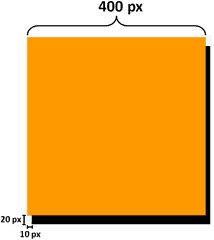
This casts a shadow with an X-offset of 10 pixels and a Y-offset of 20 pixels:


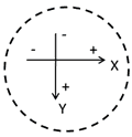
You can equally use negative values for the offsets, which will simply cast the shadow onto the other side of the element:
div {
    -webkit-box-shadow: –10px -20px #000;  /* for Chrome */
    -moz-box-shadow: -10px -20px #000;  /* for Firefox */
}

You might have noticed the use of vendor prefixes (-webkit for Chrome and –moz for Firefox), the reason for this is described in my post about the border radius here.
Adding a blur distance
To make the shadow look more realistic, you can blur the shadow by supplying an additional parameter:
div {
    -webkit-box-shadow: 10px 20px 10px #000;  /* for Chrome */
    -moz-box-shadow: 10px 20px 10px #000;  /* for Firefox */
}

The higher the number of pixels the more pronounced the effect of the blur is.
Adding opacity
What’s more? You can add opacity to the shadow to make the shadow semi-transparent, to do this in CSS3 is simple as it introduces a new rgba function which you can use to specify the colour of the shadow. Most of you should be familiar with how RGBa works (a stands for alpha which is a value between 0 and 1 with 0 being fully transparent and 1 being fully opaque) already and to use it on a shadow here’s what you can do:
div {
    -webkit-box-shadow: 10px 20px 10px rgba(0, 0, 0, 0.4);  /* for Chrome */
    -moz-box-shadow: 10px 20px 10px rgba(0, 0, 0, 0.4);  /* for Chrome */
}
Compare the two images below, using solid colour on the left and using RGBa function with alpha value of 0.4 on the right:


As you can see, the shadow on the right look a lot more believable!
Multiple shadows
With the box-shadow property in CSS3, you’re not limited to only one shadow, to specify additional shadows simply turn the box-shadow property into a comma separated list of shadow specifications:
div {
    -webkit-box-shadow: 10px 20px 10px rgba(0, 0, 0, 0.4),
                        -10px 20px 10px rgba(100, 0, 0, 0.4);
    -moz-box-shadow: 10px 20px 10px rgba(0, 0, 0, 0.4),
                     -10px 20px 10px rgba(100, 0, 0, 0.4);
}

Creating an inner shadow
You can create an inner shadow by adding the inset keyword:
div {
    -webkit-box-shadow: inset 10px 20px 10px rgba(0, 0, 0, 0.4);  /* for Chrome */
    -moz-box-shadow: inset 10px 20px 10px rgba(0, 0, 0, 0.4);  /* for Firefox */
}

You could create multiple inner shadows, though the effect tend to be a little strange if you ask me..:
div {
    -webkit-box-shadow: inset 10px 20px 10px rgba(0, 0, 0, 0.4),
                        inset -10px -20px 10px rgba(0, 0, 150, 0.6);
    -moz-box-shadow: inset 10px 20px 10px rgba(0, 0, 0, 0.4),
                     inset -10px -20px 10px rgba(0, 0, 150, 0.6);
}

Or combine inner shadow with normal shadows:
div {
    -webkit-box-shadow: inset 10px 20px 10px rgba(0, 0, 0, 0.4),
                        10px 20px 10px rgba(0, 0, 150, 0.6);
    -moz-box-shadow: inset 10px 20px 10px rgba(0, 0, 0, 0.4),
                     10px 20px 10px rgba(0, 0, 150, 0.6);
}

again, doesn’t feel quite right…
Adding a spread distance
Finally, you can add a ‘spread’ to the shadow, which basically adds some padding to the edges of the shadow:
div {
    -webkit-box-shadow: 10px 20px 0px 10px #000;  /* for Chrome */
    -moz-box-shadow: 10px 20px 0px 10px #000;  /* for Firefox */
}
Compare these two images, one with spread of 10 pixels (left) and one without:


Demo
Finally, here’s a quick demo page I’ve put together to let you play around with the box-shadow property and see its effects as you change the relevant parameters, note it only works with webkit browsers (Safari and Chrome) for now as I’m using the new range type input in HTML5 which is not yet supported in Firefox and iE.
References:
Whenever you’re ready, here are 3 ways I can help you:
- Production-Ready Serverless: Join 20+ AWS Heroes & Community Builders and 1000+ other students in levelling up your serverless game. This is your one-stop shop for quickly levelling up your serverless skills.
- I help clients launch product ideas, improve their development processes and upskill their teams. If you’d like to work together, then let’s get in touch.
- Join my community on Discord, ask questions, and join the discussion on all things AWS and Serverless.

Pingback: CSS3 Box Shadow Anlat?m?
Nice article, definetely the part about opacity which taught me something new. Thanks!
Very nice explaination really very clear !!!